Lattude
Brand
Web design
Overview
Lattude is an attorney firm specialized in fintech startups. Based in New York, they provide legal and advisory services for financial technology companies at early stage.
The brief was to reimagine a new visual identity and propose a website that matched their mission. The challenge was to keep it simple, traditional for a law firm and fresh taking into account the existing elements. Proposing minimal changes, to ensure consistency to their existing brand.
Context
Role: Brand designer
Date: December 2020
Company: → Lattude
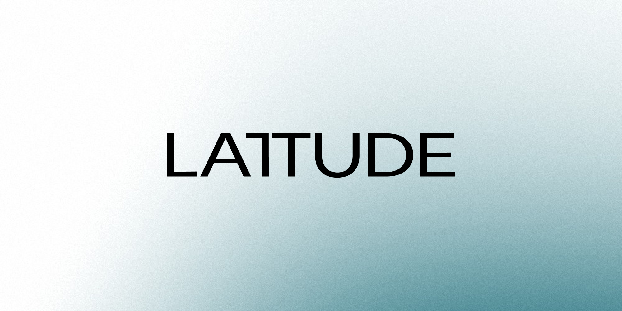
Logotype
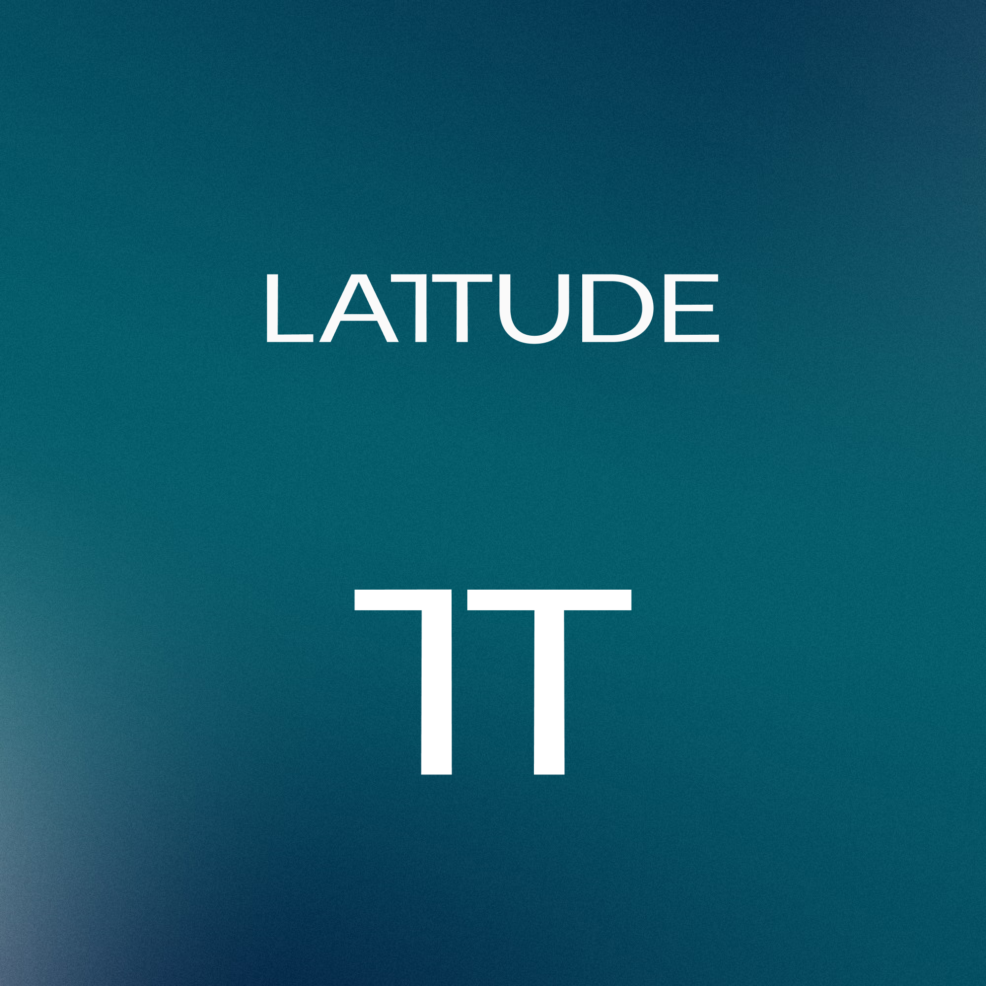
Main logo
Identity
The Lattude wordmark is a contemporary sans serif with a distinctive qualitiy: the brand’s signature joined ‘T’.
Suggesting unity and trust, the joined ‘T’ becomes a strong and recognisable symbol meant to be used accross platforms, for print and digital media.
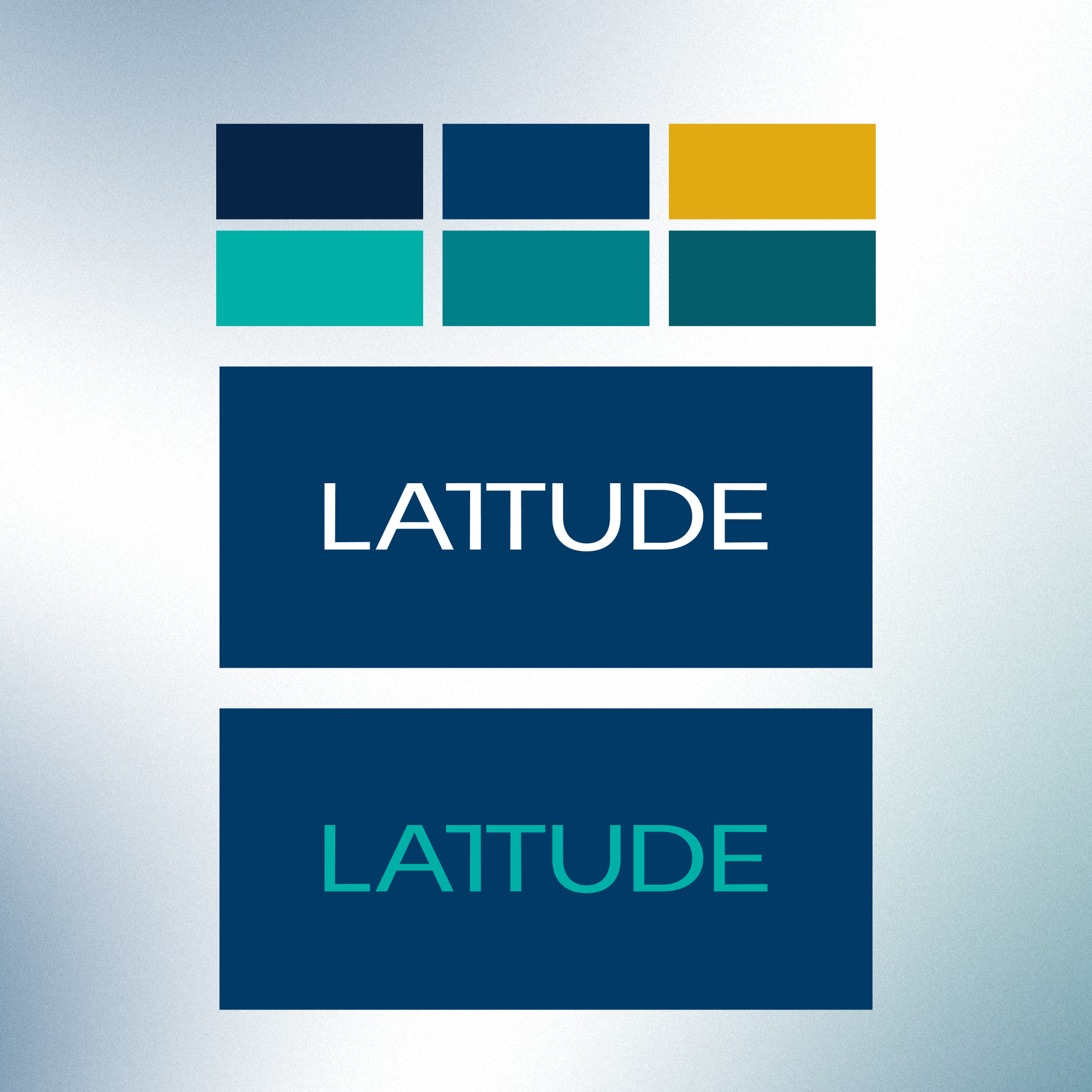
Color scheme and alternatives
Color system
The primary Lattude colour palette is conformed by blue, green and yellow. Modifying the existing colors with a difference in shades, the proposed color system was closely related to the previous one. The intention was to rely on dark colors, using bright accents.
These colours feature across Lattude branded assets including illustration, type, graphs, printed and digital materials.
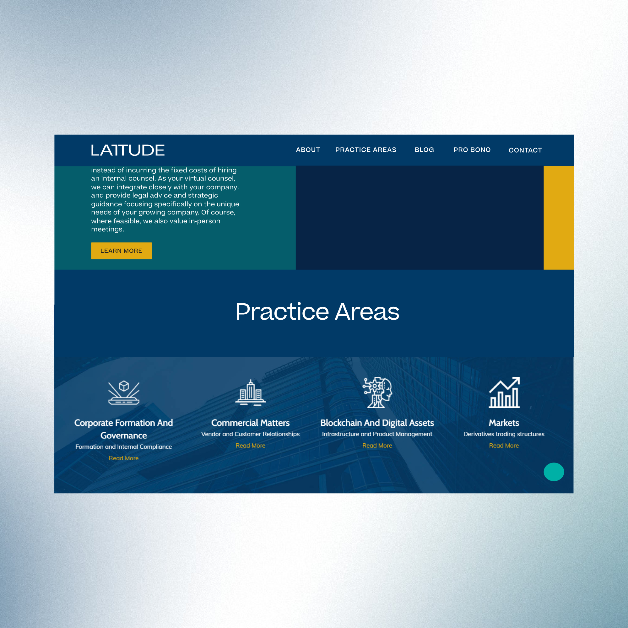
Website
Website
With the brand identity in place, the rebranding of the website intended to modify slightly and create a cohesive look and feel. Leaving out structural changes, the intention was to implement the color scheme and typography.
The proposed website changes were not implemented.