Blog
Web
Self-initiated
Overview
The project is driven by my experience looking for a space for my blog. Reflecting on the limitations of the existing platforms, my approach was to create a clean and non-intrusive platform. With a focus on legibility.
While serving a practical function, it was also an exercise of intentional experimentation, to challenge my skills in HTML and CSS after finishing an online course in 2020.
Context
Role: Web designer and web developer
Date: March - June 2020
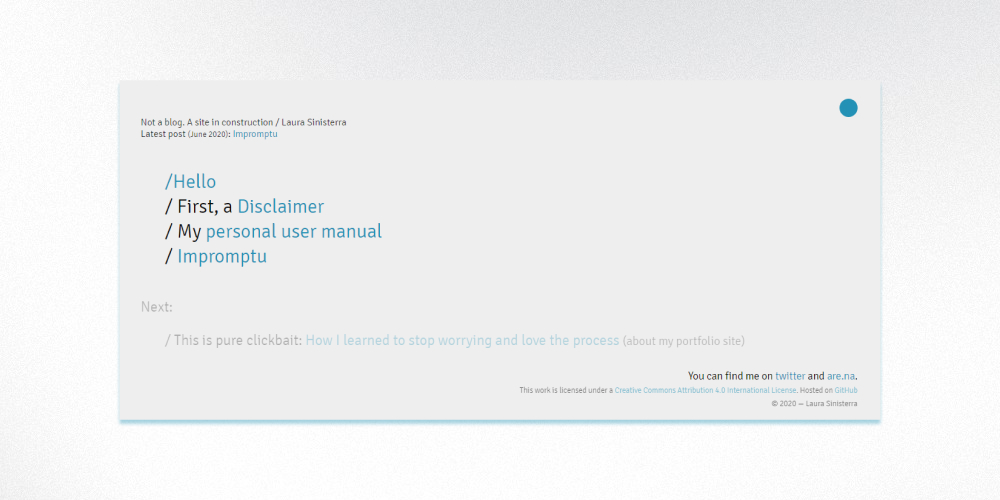
Home page
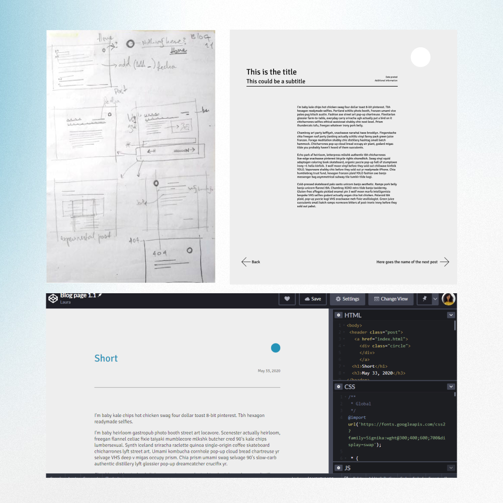
Initial sketches and wireframes
Starting point
The project started by spending a lot of time browsing through blogging platforms and drawing insights from how they are built and what their main purpose is. In my decision-making process, I decided to place a higher priority to the text, and figure out the best way to translate this into the website user experience.
I realized that the experience of reading online has become distracting. It is frustrating to navigate the amount of buttons and popups in every platform, from blogs to news sites. I asked myself, what would be the minimal version of a blog website?
Sketches and wireframes
My process always starts with pencil and paper, sketching by hand allows me to think free of technical constraints and get a feel of what the main structure will be. I started by recognizing the basics elements: body of text, title, date and navigation.
Because this was my second time designing and building a website, I had to learn and research the technical aspects of what I wanted to do. Having a clear concept in mind made the process simpler.
With the mid-fi wireframes, I organized the elements and negative space was one of my priorities. Before moving into the final website, I did prototypes in Codepen to make sure everything was working correctly.
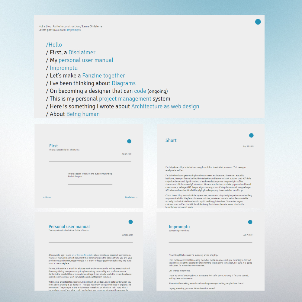
Examples of blog posts and longer titles
Execution
The title design in the home page makes it easy to find content. Linking the ideas together was a fun way to show a general overview of the content.
Chartering new territory, one of the more challenging aspects of the build was the blue dot as a back button. It is also one of my favorite things for this project. It was hard to do while I figured out what was possible but very rewarding to see the end result.
End results
This was a simple yet challenging project that served as a consolidation of what I learned in HTML and CSS at the beginning of 2020.
Sharing a project in public was helpful for accountability. Testing my skills in private is one thing, publishing means I need to pay attention to every single detail: from code to visuals.