Inner Circle
Brand
Diagram system
Overview
Inner Circle is a community based in London that provides tools and a safe space for people to focus on spiritual and personal growth.
The brand was looking for a high-end and down to earth identity. Based on the concepts of growth, wellness, accessibility and light.
Context
Role: Brand designer
Date: Sept - Jan 2021
Company: Inner Circle
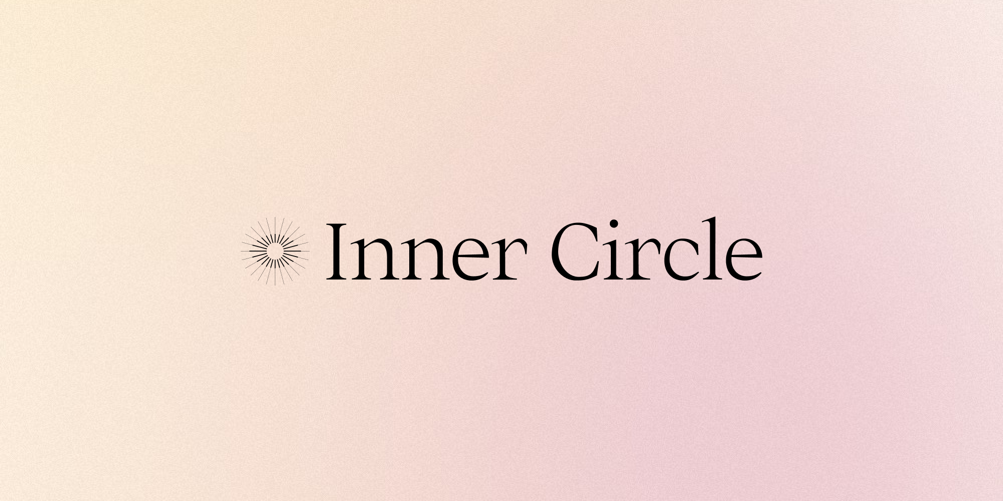
Logotype
Main logo
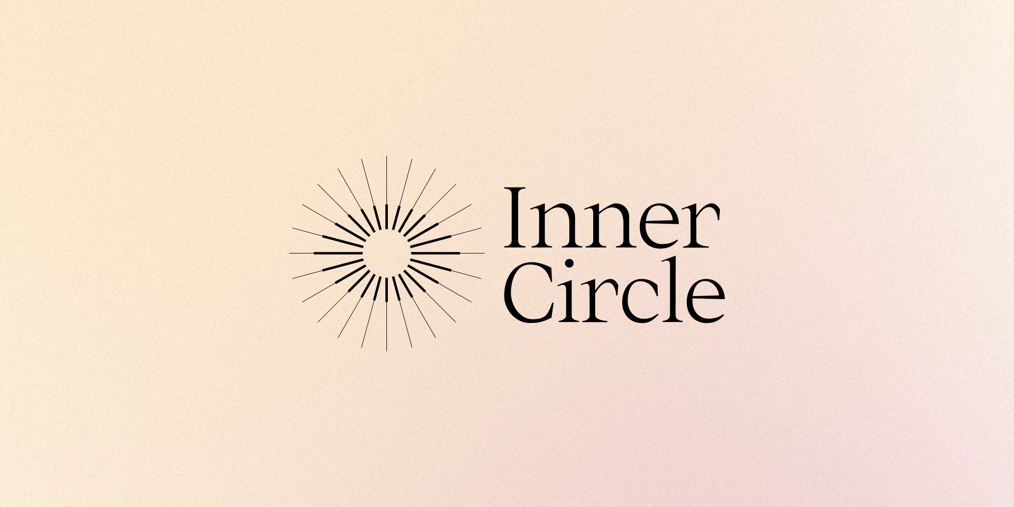
Identity
Using the existing name, I created two circles with a set of lines that merge in order to create an outer outline and an inner outline. The outer circle becoming a circular shape and the inner circle taking the form of an eye.
The graphic element symbolises the expansive quality of the personal development process and the lightness of the sun rays, representing growth.
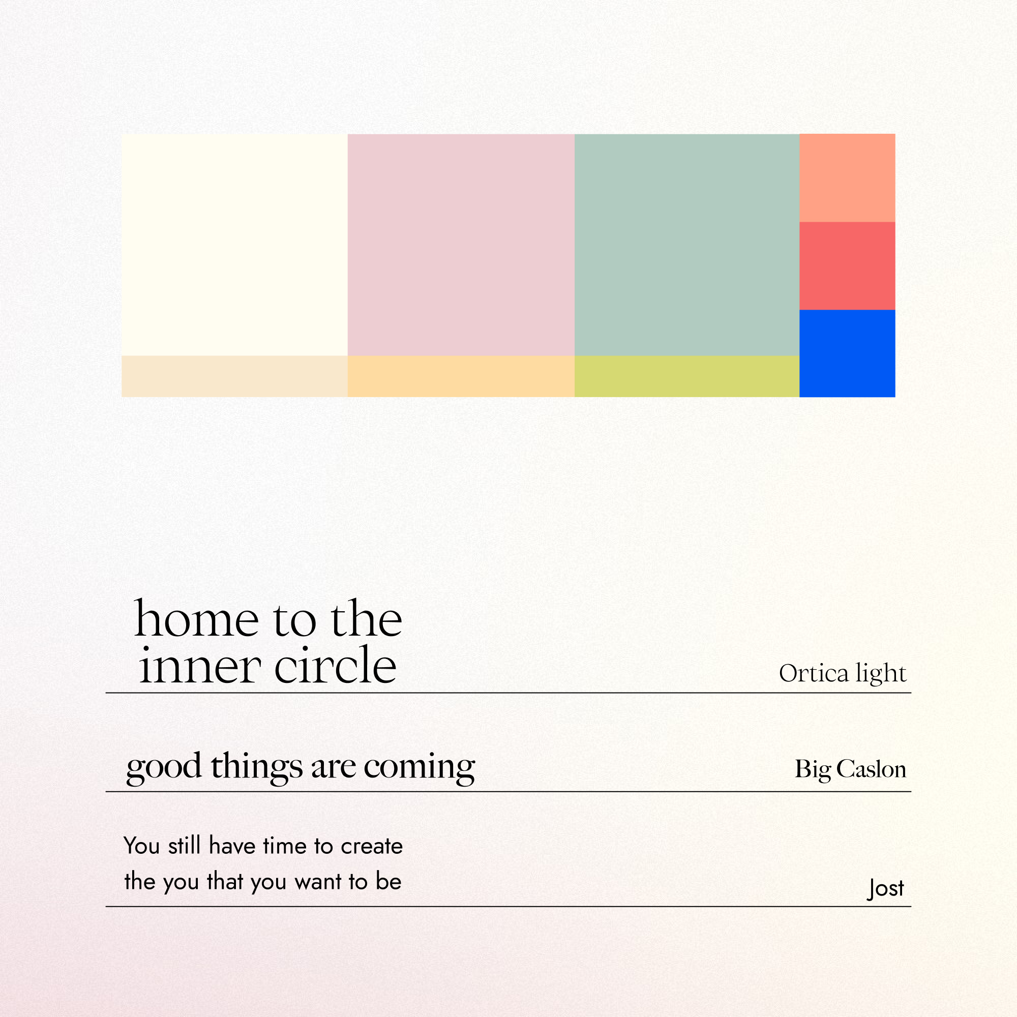
Color scheme and typography
Color scheme
The primary colour palette consists of three core soft tones of beige, pink and green, each one with a complementary tone for illustrations and backgrounds.
For flexibility and adaptability to the fast moving pace of social media, I created an extended color palette featuring three distinct saturated colors for variety. Coral, red and blue work as accent colours to increase the number of possible combinations.
Typography
To express the sense of lightness, the chosen typography for this project is Big Caslon and Ortica. For supplementary information, the sans serif Jost offers a balance. In a functional way, this approach summarises the client's philosophy and vision.
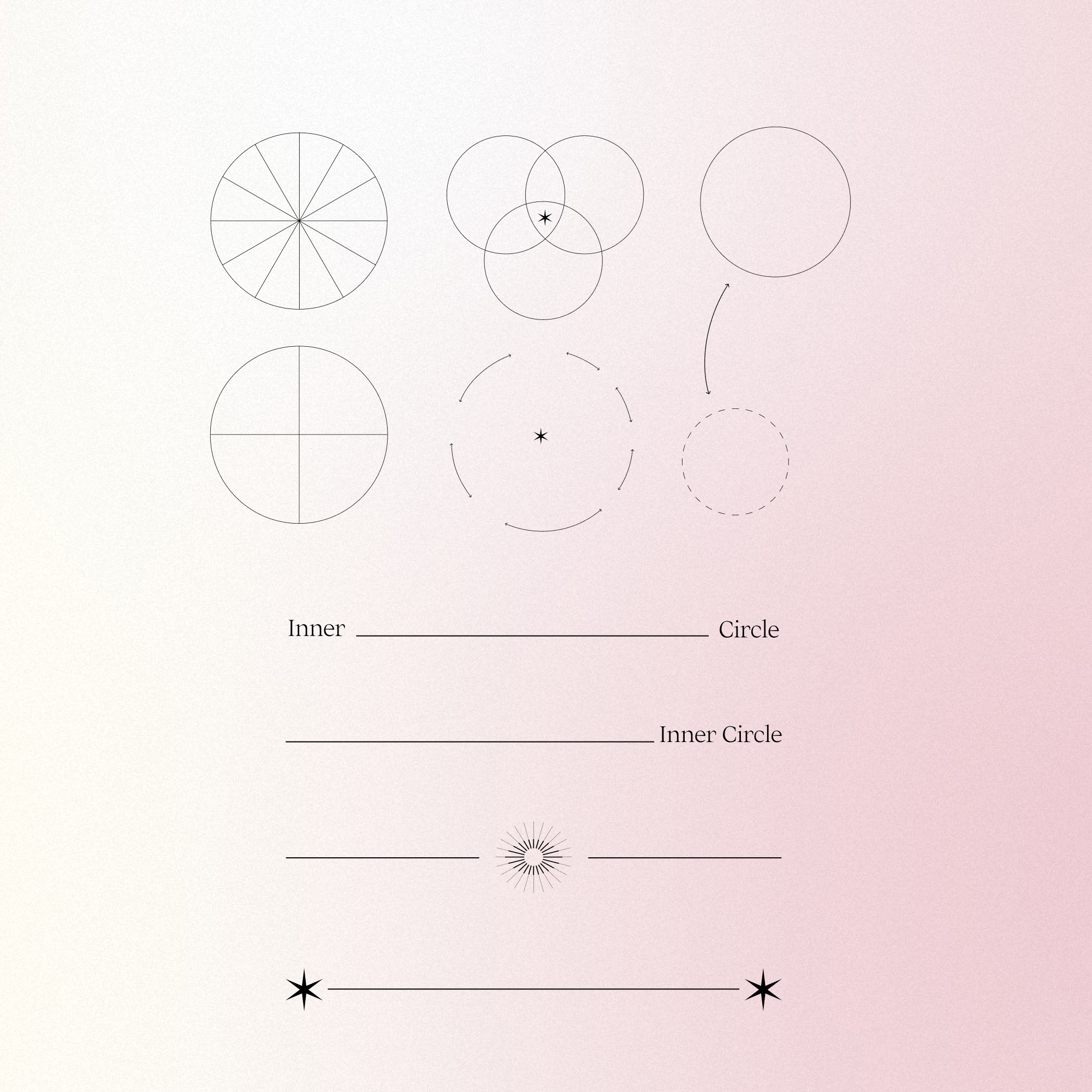
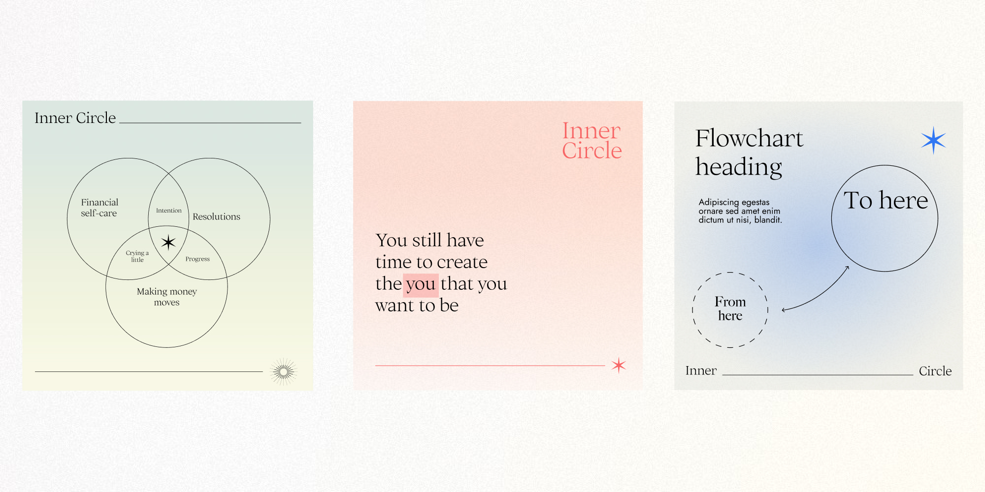
Diagram system
Diagram system
For Inner Circle, it was essential to develop an elevated and highly flexible identity. Aiming for a dynamic visual system, I used a lenguage of lines to match the main symbol.
Depending on the context, the lines can be used to highlight connections and the stories we can tell through growth. The brand library of graphic forms can work across many different formats, with a particular interest on social media.
Use case: social media visuals